Mobile Design, UX UI Design
Jollibee Mobile Redesign
Jollibee, my personal favorite fast-food restaurant chain, is renowned in the Philippines for its fusion of Western fast-food classics with Filipino flavors. This is my first UX/UI case study, where I naturally chose the Jollibee delivery app due to its personal significance. While revisiting the app, I noticed design inconsistencies, which fueled my motivation for a redesign.
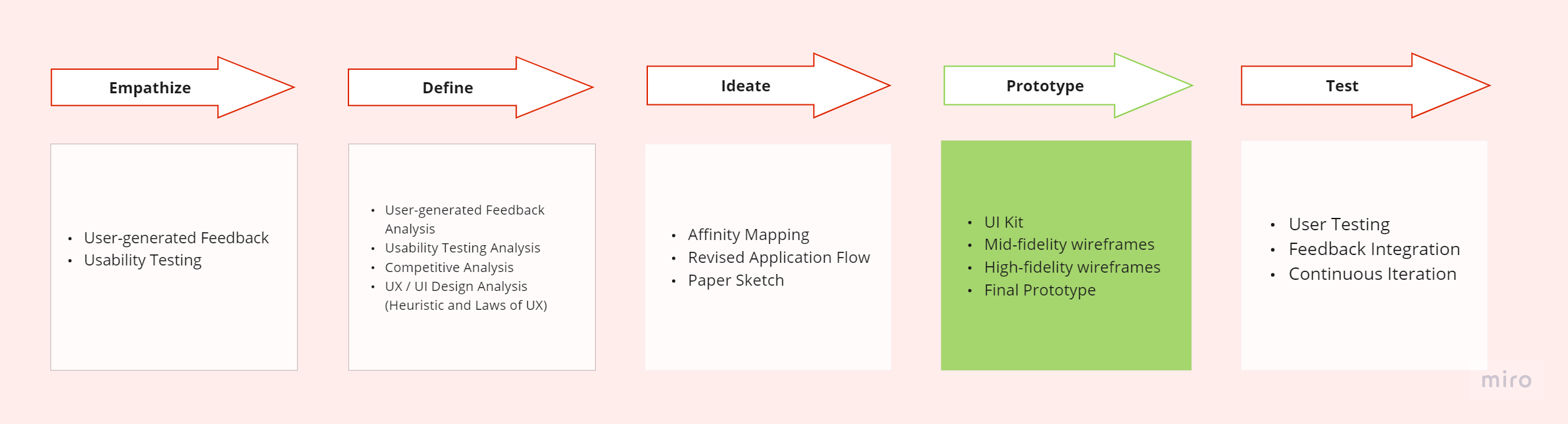
Design Process
This project is still ongoing. I'm currently in the prototyping phase and plan to conduct user testing. But so far, the basis of the design relies on research results, including usability testing, heuristic and design evaluation, and user-generated feedback. The written case study is also a work in progress.
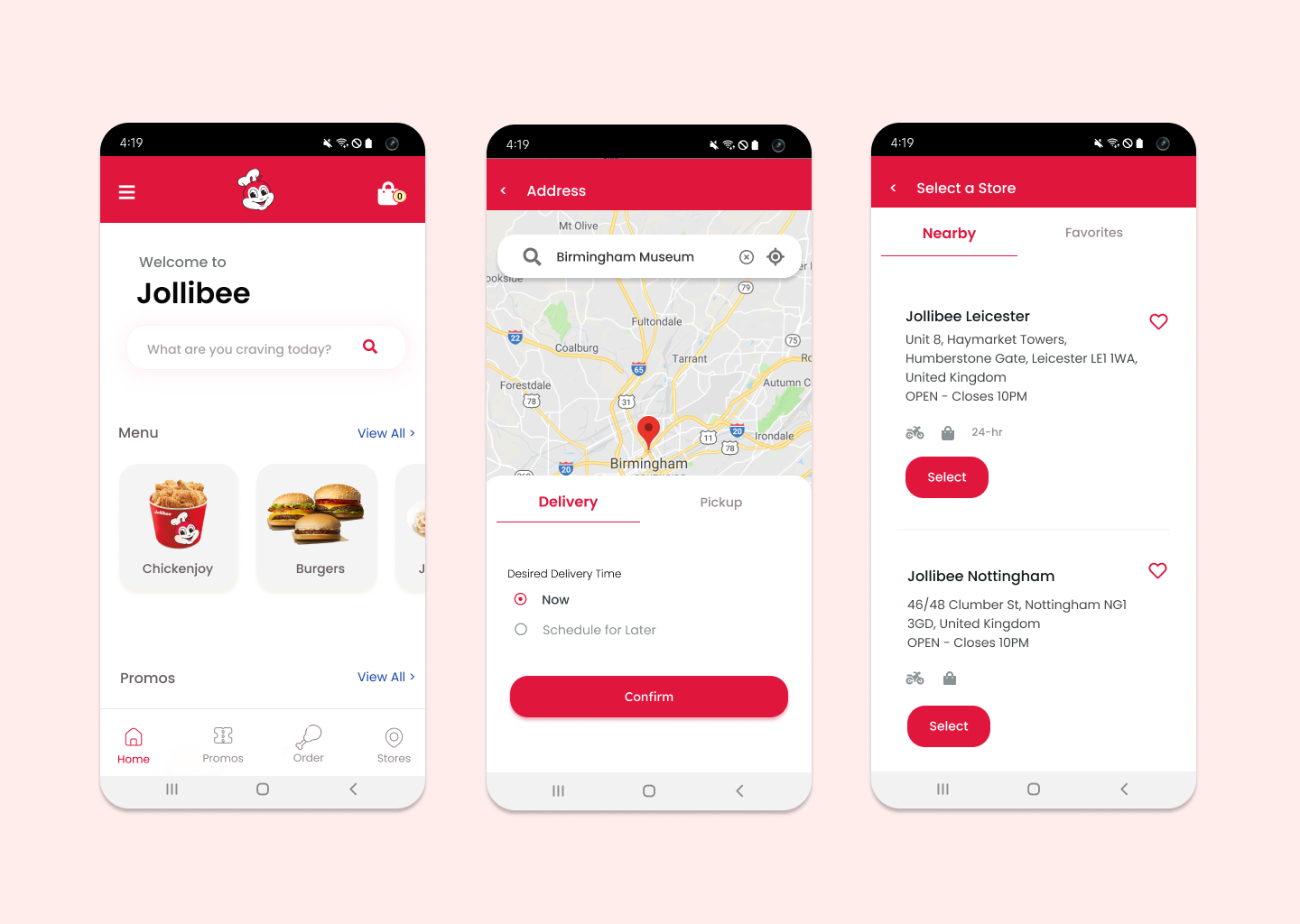
Home and Address Sections
Many of the issues that surfaced are related to the compact design approach in Jollibee's mobile interface. They attempted to fit too much information into limited space. In response, I restructured the UI. For instance, in the Address section, I ensured that the choice for delivery or pick-up is revealed only after the user has entered their address, whereas in their original design, everything was displayed upfront. Additionally, Jollibee's previous design predominantly featured red and orange colors, used extensively, even for menus and cards. In my redesign, I retained red as the primary color for buttons and calls to action. To improve clarity, I introduced more spacing between elements and containers, adopting a minimalist design and card layout for consistency. Moreover, recognizing that Jollibee lacked a search bar, unlike its primary competitor, McDonald's, I incorporated one into the interface.
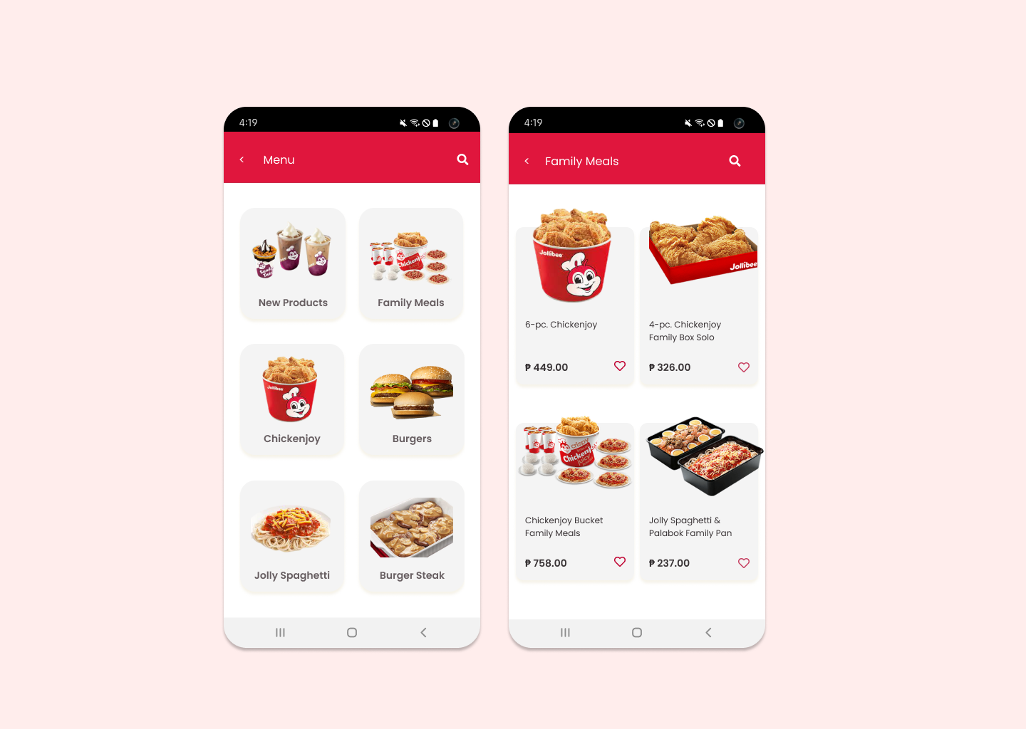
Menu and Meals Sections
I removed the red color from the cards used to display meals or menu items. I also added a search icon above to improve the visual representation of the search function and make it more accessible.
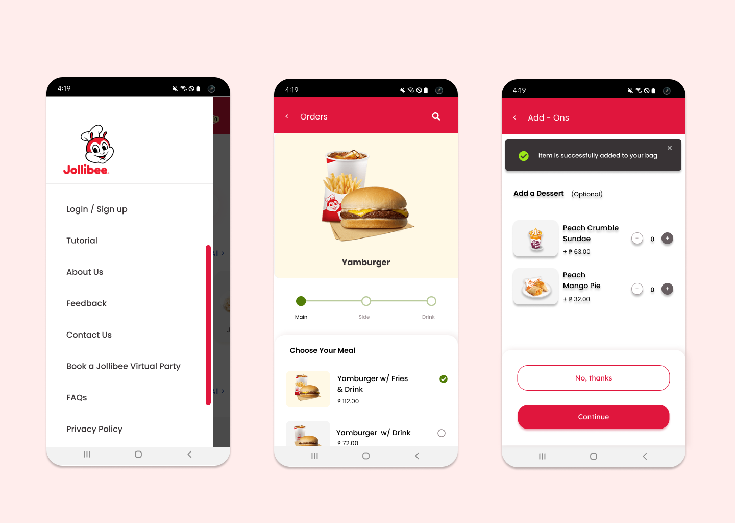
Navigation and Ordering a Meal
For the sidebar navigation, I incorporated scrolling to indicate to users that the content is not yet finished. In the original design, they used lines per section, which often misled users into thinking that the content had ended. Additionally, I enlarged both the picture and the banner. In Jollibee's original design, the banner was small and disappeared quickly. In the new design, users have the option to close it at their convenience.
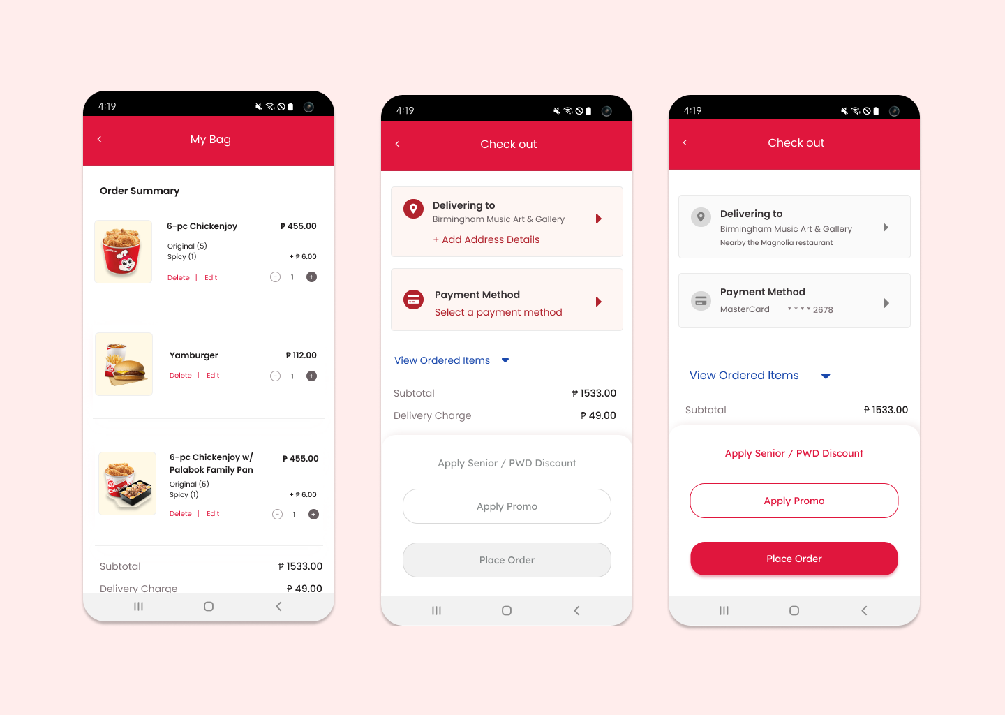
My Bag and Checking Out
I simplified the content of the Bag. In the original Jollibee design, they asked for more delivery details, which could be requested later once the user decides to place the order. Additionally, I used light pink to indicate the need for information. In the original design, there was no visual hierarchy.
Tracker and Promo Sections
I enlarged the tracker and separated the thank you message as a pop-up, giving the user the choice to view the tracker or return to the home screen. Additionally, for the promo, I added a 'redeem' button because the original design contained numerous tags and button-like elements that did not emphasize the primary action
Let's get in touch
rosebahan@gmail.com